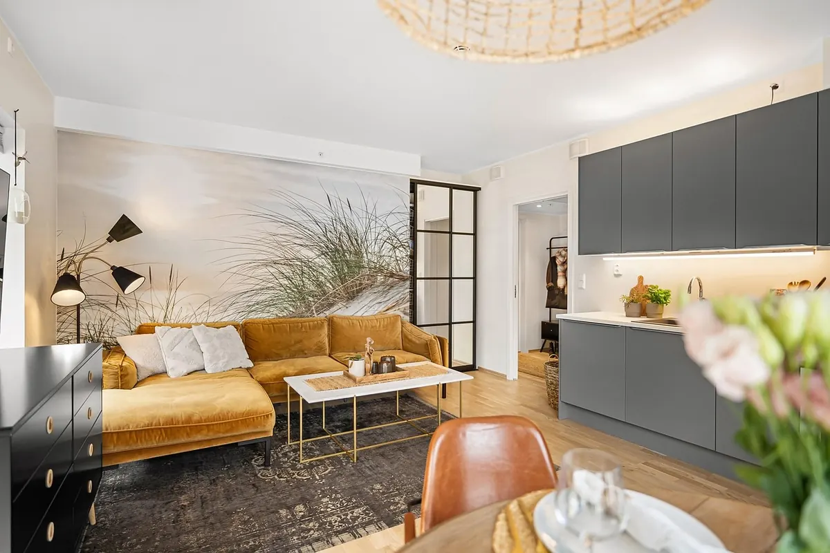
A bulb's color temperature shapes how a room feels more than almost any other choice you'll make in it. Get it right and the paint looks richer, dinner looks appetizing, and your face looks like your face. Get it wrong and a well-decorated room can feel like a waiting area at two in the morning. The good news is that it all comes down to one number, measured in Kelvin, and once you can read it, choosing bulbs becomes a five-second decision instead of a guess.
Kelvin measures the color of light, not how much of it you get. Lower numbers are warmer, shifting toward amber and orange. Higher numbers are cooler, shifting toward blue. A 2700K bulb glows like a table lamp in a hotel lobby. A 5000K bulb looks closer to flat midday sky.
Brightness is a separate spec entirely, measured in lumens. Wattage tells you how much electricity the bulb uses, which matters far less than it did in the incandescent era. So a 5000K bulb and a 2700K bulb with the same lumen output are equally bright. They just feel completely different in a room.
One more spec worth a glance: CRI, or color rendering index. Anything rated 90 or above will make wood, fabric, and food look close to how they look in daylight. In a living room it's a nice-to-have. In a kitchen, it's close to essential.
Kitchens are where color temperature does the most visible work, because you're judging food, chopping produce, and looking at yourself over a sink. Aim for 3000K to 3500K. It's clean and accurate without tipping into the blue-grey cast that makes oak cabinets look dusty and raw chicken look unappetizing.
Under-cabinet lighting deserves its own thought. Because it's close to the counter, it throws hard shadows, so a slightly cooler 3500K strip keeps the work surface readable. Pair it with 3000K overheads and the two temperatures blend into something neutral.
For bathroom vanities, put light on both sides of the mirror at face height rather than a single fixture overhead. That overhead-only setup drops shadows under your eyes and makes every blemish look deeper than it is. 3000K at the mirror is flattering and still honest. Reserve 4000K for laundry rooms and utility corners, where clarity beats atmosphere.
Start at 2700K and treat anything cooler as a deliberate exception. This is the temperature that makes upholstery look soft, art look intentional, and evening conversation feel unhurried. If you want the room to lean cozier, 2400K in table lamps works beautifully.
The real trick in these rooms is layering rather than picking one perfect bulb. A ceiling fixture alone at full brightness flattens a living room. Combine it with a floor lamp, a table lamp, and a dimmer, and you can push the overhead down to a glow while the lamps carry the mood.
Dining rooms respond well to a pendant hung low over the table with a 2700K bulb, dimmed. That low, warm pool of light is why restaurant tables feel intimate even when the room is loud.
Whatever you do, don't mix 2700K and 5000K in the same sightline. The contrast reads as a mistake, not a design choice.
Drop to 2200K–2700K here. Bedrooms are the one place where warmer is almost always better, and where the ability to dim matters more than the exact number. A bulb that dims from 2700K down to 1800K as you lower it, often sold as "dim to warm," is worth the small premium for a bedside fixture.
Skip the 4000K ceiling light if you can. Bright cool light overhead in a bedroom reads as clinical, and it's rough on your eyes when you switch it on before bed. For reading, a 2700K bulb around 400 to 500 lumens in a shaded lamp is plenty, and a directional or adjustable one lets you point light at the page instead of across the room.
For most desk work, 3000K–4000K is the range. 4000K keeps you alert during a long afternoon of focused tasks. 3000K is easier on the eyes once the sun goes down and you're answering one last email. If you work into the evening regularly, an adjustable bulb or a desk lamp you can swap is a simple, cheap upgrade.
Position matters as much as temperature. A bright light directly above and behind you throws glare onto your monitor. Put a task lamp to the side of your dominant hand, and if you spend long hours at the screen, a soft light behind the monitor reduces the harsh contrast between the screen and a dark wall.
If you take video calls, front lighting at 3000K–3500K flatters skin tones, while a 2700K lamp somewhere in the background makes the room behind you feel like a home rather than a cubicle.
Bulb aisles are confusing, packaging is inconsistent, and the same Kelvin rating looks different through a fabric shade than it does bare. So buy a single bulb first and live with it for an evening.
Then commit. Keep one temperature per sightline, so a hallway and the kitchen it opens into match at around 3000K, and stock spares of the ones you like so a burnt-out bulb doesn't get replaced with whatever's in the drawer.
When a room feels off and you can't say why, change the bulbs before you repaint, restyle, or buy new furniture. It's the cheapest fix in the house, and it's usually the one that works.
Photo: Алексей Вечерин / Pexels